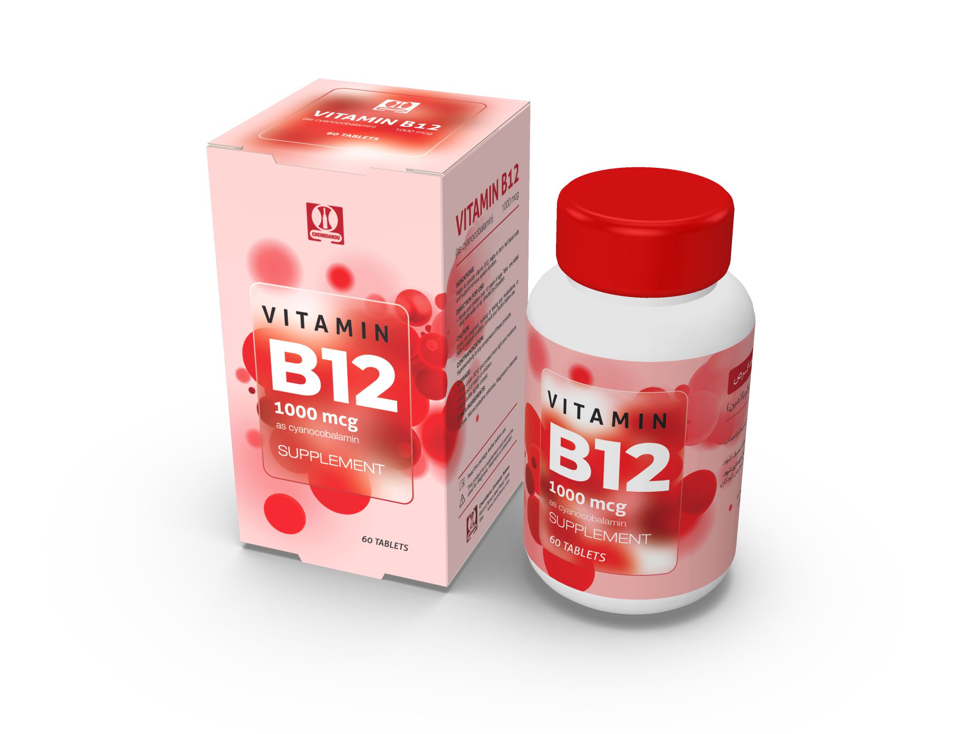
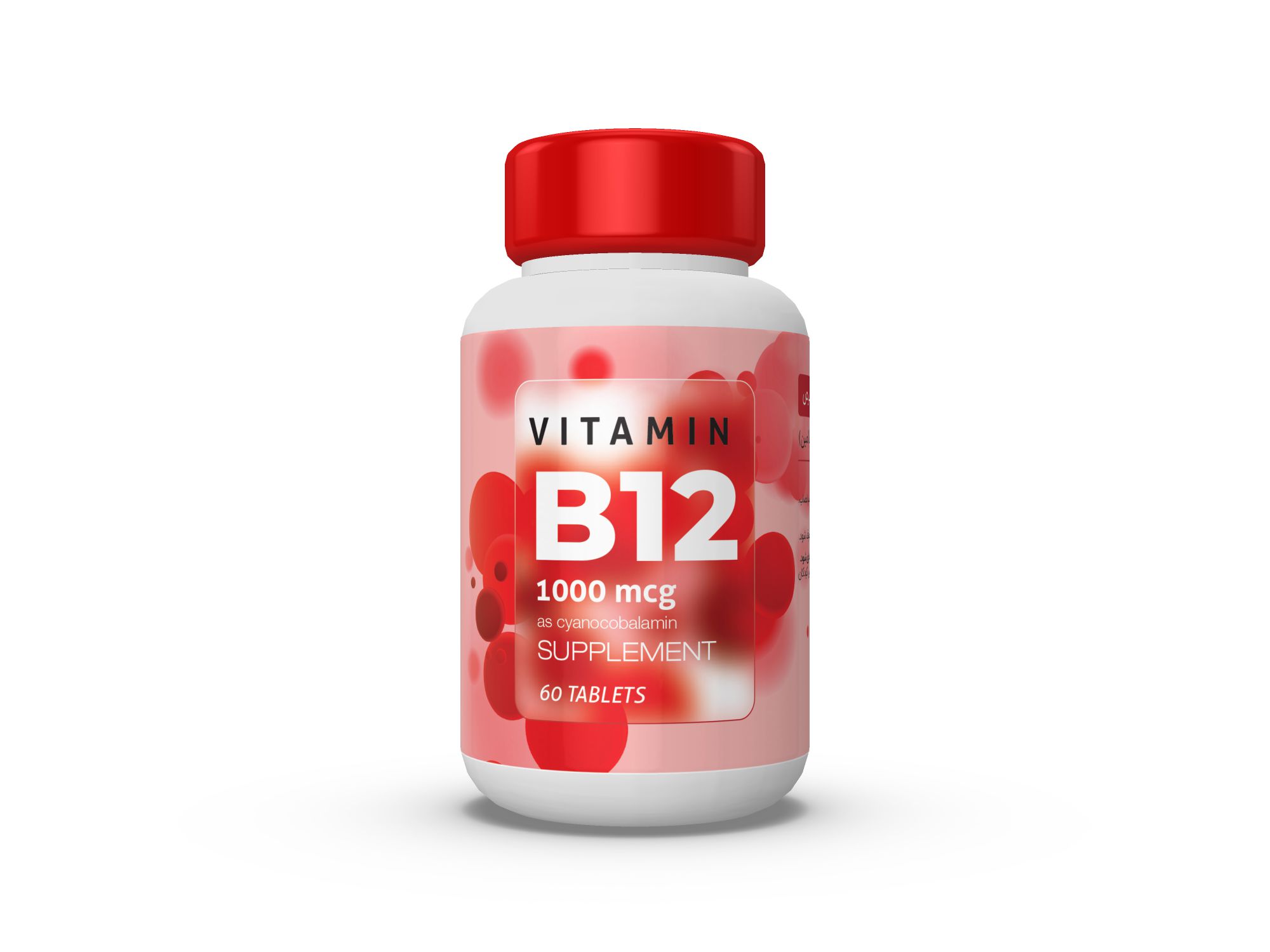
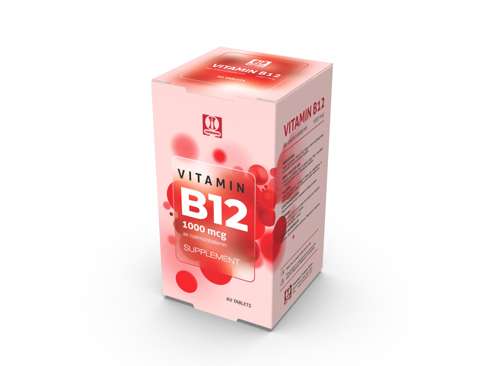
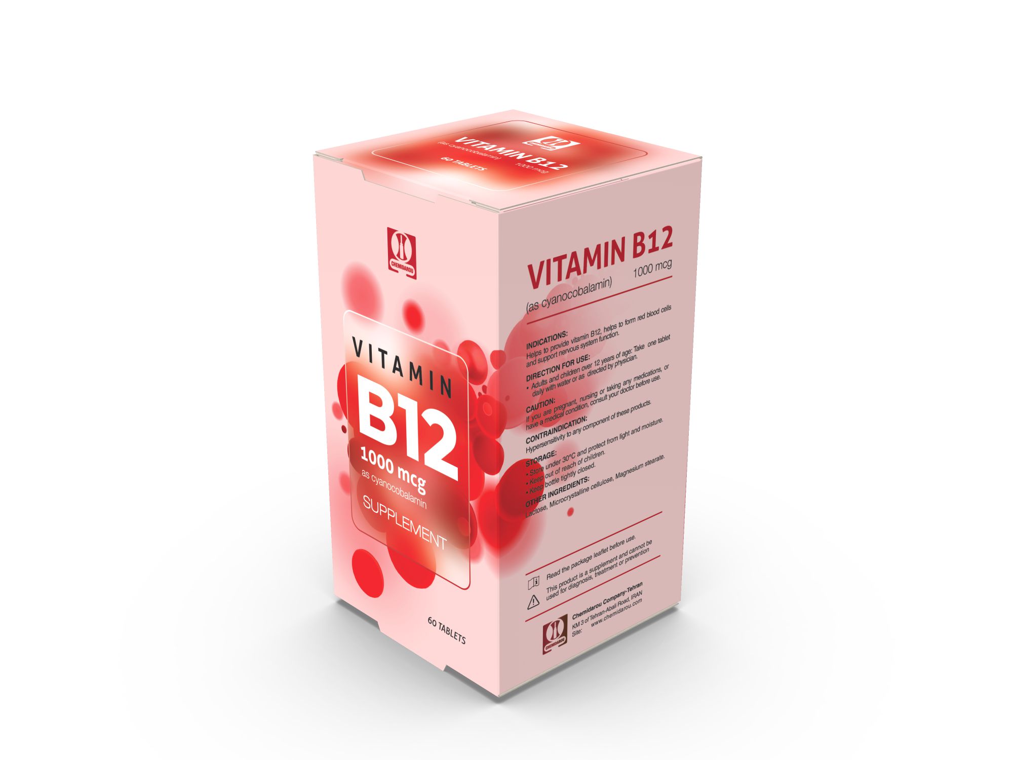
The graphic design for the tuck-end paperboard box and label of the vitamin B12 supplement is thoughtfully crafted to convey its purpose and benefits. The use of red circles as visual elements not only adds a vibrant and eye-catching touch to the design but also serves as a representation of red blood cells, emphasizing the supplement’s role in supporting their formation. This creative approach helps to create a visual connection between the product and its intended health benefits.
The overall supplement packaging design is aimed at capturing the attention of potential consumers and effectively communicating the supplement’s purpose. The choice of colors, particularly the use of red, symbolizes vitality and energy, which aligns well with the product’s focus on supporting overall health and well-being. The label design complements the box design, ensuring a cohesive and visually appealing presentation.
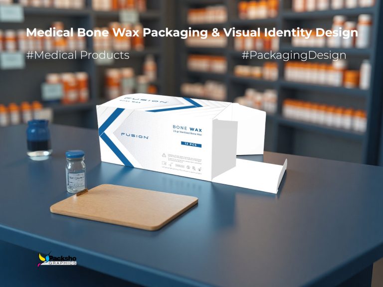
Packsho Graphics, as an experienced packaging designer, understands the importance of creating custom solutions that stand out in a competitive market. By incorporating unique graphic elements and considering the target audience and product characteristics, they successfully create a visually striking packaging design that captures the essence of the vitamin B12 supplement and communicates its benefits to potential consumers.
In summary, the graphic design for the tuck-end box and label of the vitamin B12 supplement showcases creativity and attention to detail. The use of red circles adds visual interest and serves as a representation of red blood cells, emphasizing the supplement’s role in supporting overall health. Packsho Graphics excels in designing custom packaging solutions that effectively convey the purpose and benefits of the supplement while captivating the target audience.