Project Overview: Aurora Toilet Paper Pack of 4 Packaging Design
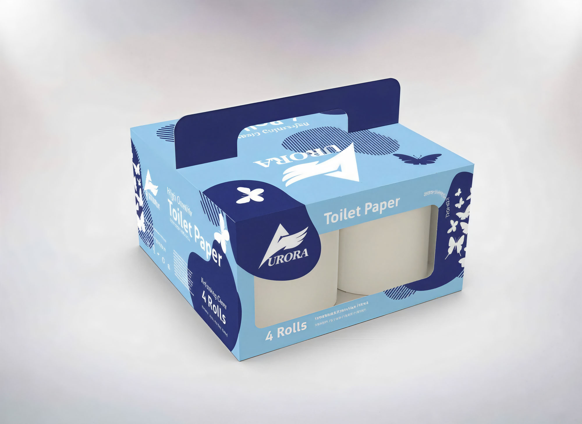
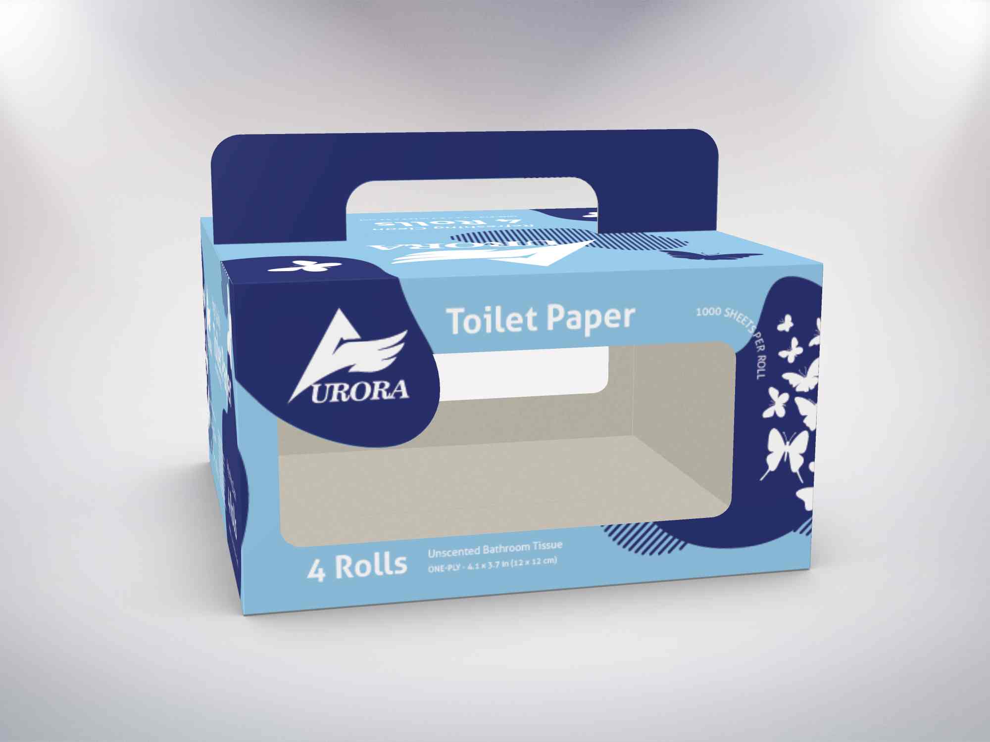
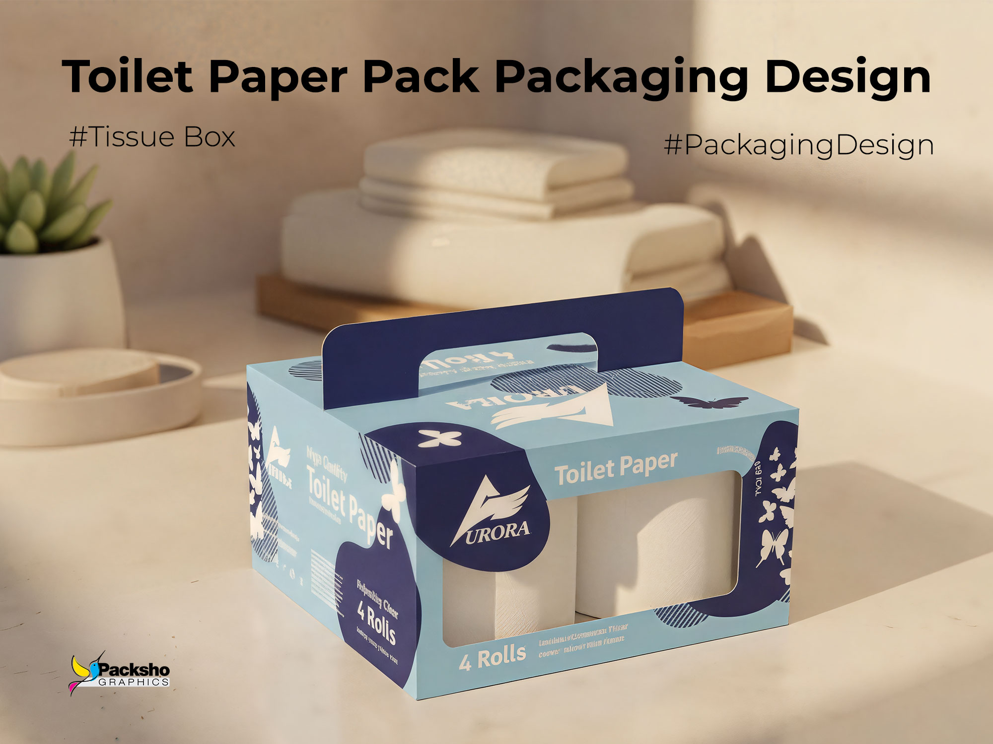
The Aurora Toilet Paper Pack of 4 Packaging Design exemplifies the harmony between functional packaging structure and refined visual branding. Conceived and executed by Packsho Agency, this project transforms an everyday household item into a well-branded, memorable, and practical retail experience. Designed for convenience and visual appeal, the packaging features a smart top-handle structure, precision-cut viewing windows, and a clean, modern graphic identity that reflects the brand’s emphasis on freshness, softness, and purity.
Understanding the Brand and Market Context
Aurora is a brand that represents reliability and everyday comfort. The design challenge for Packsho Agency was to craft a packaging system that communicated hygiene and softness while reinforcing the brand’s sense of care and quality. The Aurora Toilet Paper Pack of 4 needed to stand out on retail shelves, balance practicality with aesthetics, and ensure a premium perception within a highly competitive consumer goods category.
To achieve this, Packsho Agency focused on the psychology of color and simplicity of form. The soft blue tones project cleanliness and trust, while the white butterflies and organic shapes hint at softness and gentleness — qualities inherently tied to the product itself. Every line and shade was chosen deliberately to create a cohesive visual language that mirrors the tactile softness of the product.
Structural Design and Functionality
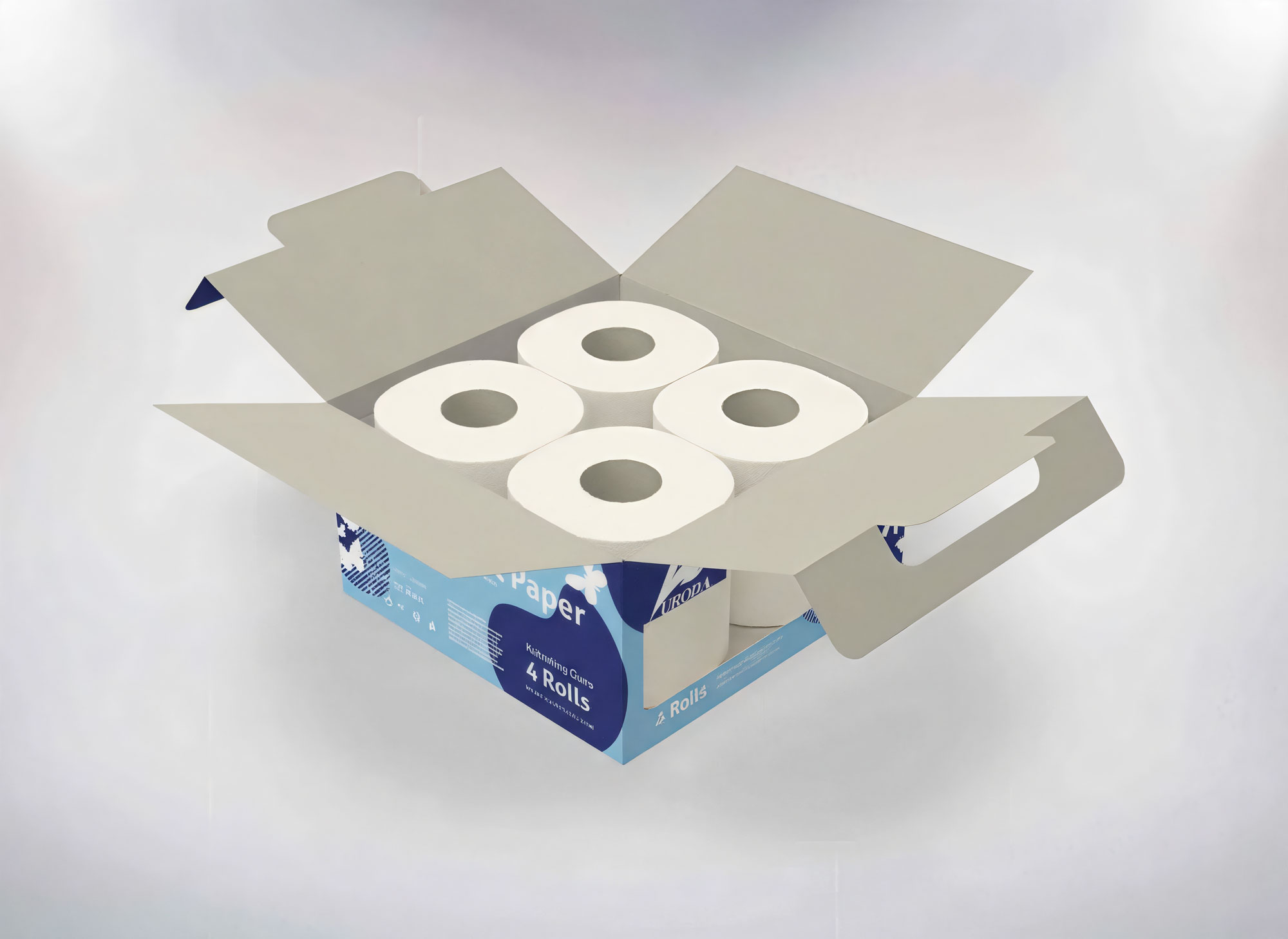
From a structural perspective, the packaging is built for convenience and durability. The box features a carrying handle integrated into the top panel, allowing users to transport the 4-roll pack effortlessly. This ergonomic handle ensures stability and comfort while adding a refined architectural touch to the form factor. The two side windows offer visibility of the rolls inside, subtly communicating product quantity and cleanliness without requiring the box to be opened. This not only enhances transparency but also builds trust at the point of purchase.
By aligning form with function, Packsho Agency ensured that the design meets both the retailer’s logistical requirements and the consumer’s lifestyle expectations. The structural design also optimizes stacking and storage during transportation, showcasing the agency’s expertise in engineering packaging that is both visually engaging and commercially efficient.
Graphic Design and Brand Expression
The visual language of the Aurora Toilet Paper Pack of 4 speaks directly to its audience. The light blue color palette, paired with navy accents, establishes a crisp, clean identity that’s instantly recognizable. The use of bold typography for the Aurora logo against a contrasting background reinforces brand recall, while subtle textures and patterns add depth to the otherwise minimalist composition.
Playful butterfly silhouettes dance around the sides of the box — a symbolic gesture representing lightness and purity. Their dynamic arrangement adds movement and softness to the design, preventing it from feeling static or industrial. The result is a packaging identity that feels fresh, modern, and trustworthy.
Material and Printing Techniques
The packaging is crafted from high-quality coated paperboard, balancing sturdiness with visual elegance. The smooth matte finish enhances the premium feel, while spot UV accents subtly highlight key brand elements. These choices demonstrate Packsho Agency’s commitment to blending technical precision with creative intuition.
The production specifications were carefully optimized for mass manufacturing, ensuring that the design integrity remains intact across various print runs. Each visual and structural detail was tested through prototyping to confirm both durability and visual harmony.
Project Info
- Client: Aurora
- Product: Toilet Paper 4-Pack
- Structure: Cardboard box with top handle
- Features: Two transparent side windows, ergonomic handle
- Services: Structural Design, Graphic Design, Production Consultation
Impact and Brand Results
The final design not only provided functional advantages but also elevated the brand presence at retail points. Customers are immediately drawn to the combination of transparency and design purity. The see-through windows communicate authenticity and cleanliness, while the distinct color language reinforces product identity in a competitive market. The box’s handle transforms a basic household necessity into an object of thoughtful design — easy to carry, easy to recognize, and easy to trust.
Retail feedback highlighted the product’s improved shelf appeal and customer perception of quality. The consistent application of Aurora’s design language across product sizes and packaging variations further strengthened the brand’s visual coherence.
Design Philosophy at Packsho Agency
At Packsho Agency, packaging design is more than surface decoration — it is a storytelling medium. The Aurora Toilet Paper Pack of 4 project demonstrates how functional packaging can carry emotional weight and brand values without sacrificing utility. Every detail, from the material choice to the graphic tone, was designed to evoke comfort and cleanliness while making the consumer’s daily life a bit more effortless.
By balancing artistry and engineering, Packsho Agency showcased its 20+ years of expertise in packaging innovation — delivering solutions that resonate with modern consumer sensibilities while maintaining manufacturing efficiency.
Conclusion
The Aurora Toilet Paper Pack of 4 Packaging Design is a perfect synthesis of structural ingenuity and visual clarity. It captures what great packaging should achieve: practicality, distinction, and brand storytelling. Through clean design and thoughtful craftsmanship, Packsho Agency turned a utilitarian product into an emblem of reliability and care.
If you’re looking to develop packaging that speaks clearly to your audience while standing strong on shelves, connect with Packsho Agency — where every fold, line, and color tells your brand’s story.

