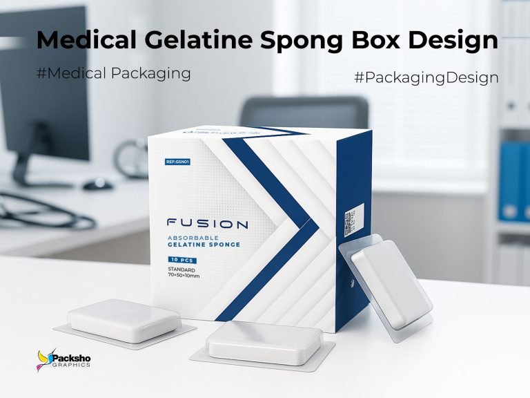
Project overview
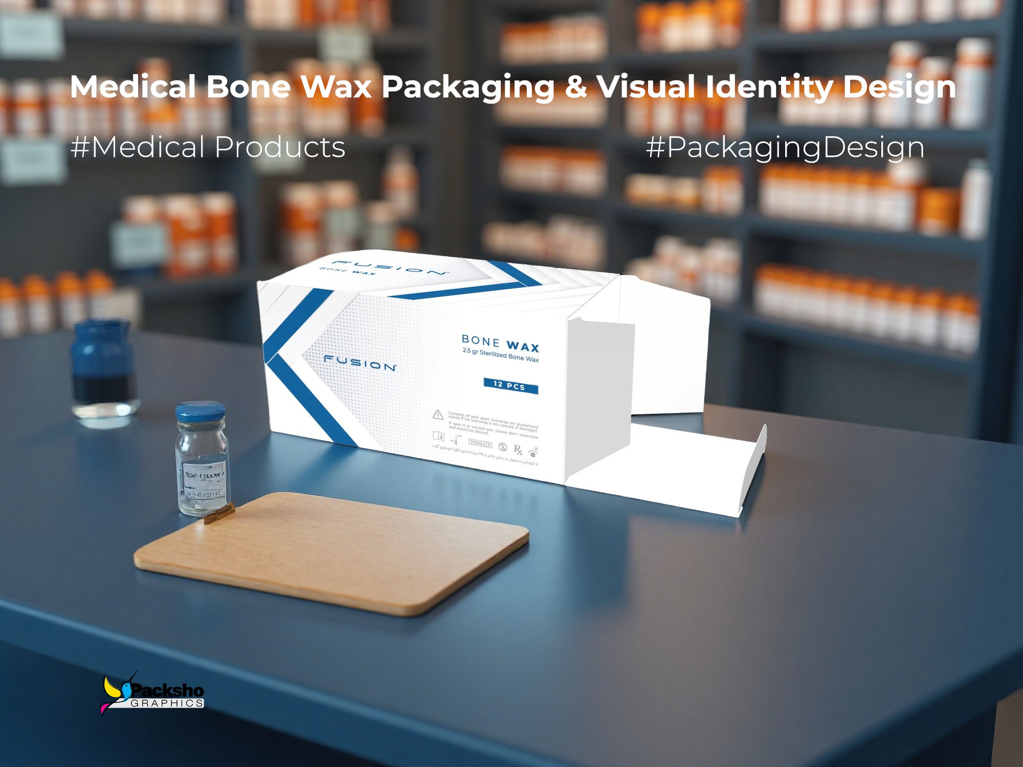
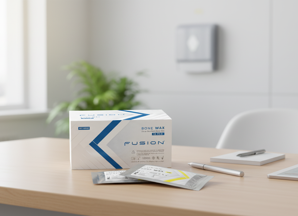
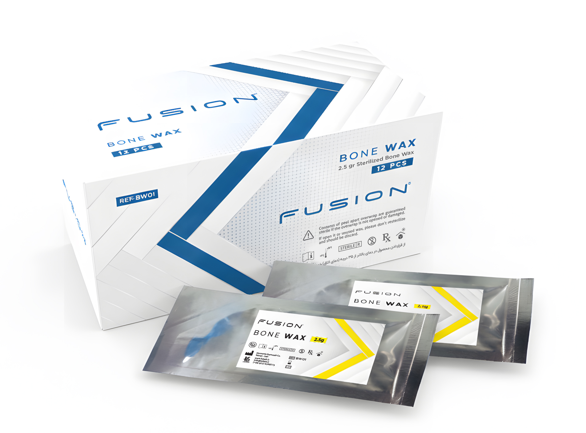
The Fusion project — Medical Bone Wax Packaging & Visual Identity Design for Pharmaceuticals — presented Packsho Agency with a multifaceted brief: create a packaging system and visual identity that communicates clinical precision while protecting sterility, simplifies handling in operating-room workflows, and reads clearly across supply-chain touchpoints. The product is a sterile bone wax delivered in single-use sachets with a branded retail/carton outer box. The packaging and the pouch were designed by our team to ensure every tactile, typographic and structural decision serves both function and brand impact.
Design challenge
Bone wax is a clinical product used in surgical procedures, and the packaging must communicate safety, clarity, and reliability at a glance. Competing products often rely on dense text or purely technical visuals that fail to build a distinct identity. Our task was not only to house the sterile sachets but to craft a visual voice for the brand so it could be recognized by procurement officers, clinicians, and distributors. The constraints were clear: sterile barrier protection, clear regulatory labeling, ergonomic unboxing for fast access, and a distinctive shelf and tray presence. The work required a careful balance between medical sobriety and confident brand character.
Strategic approach
We approached the brief with a three-tier strategy: clarity, confirmation, and distinction. Clarity through stripped-back information hierarchy and legible typography; confirmation through materials and finishes that suggest sterility; and distinction through a signature graphic motif and restrained color palette. At Packsho Agency we conducted stakeholder interviews with clinicians, observed inventory handling in simulated operating-room scenarios, and ran quick visual preference tests with procurement professionals. These exercises guided decisions about the scale of typography, iconography for handling and disposal instructions, and the tactile finish of the outer carton and inner sachets.
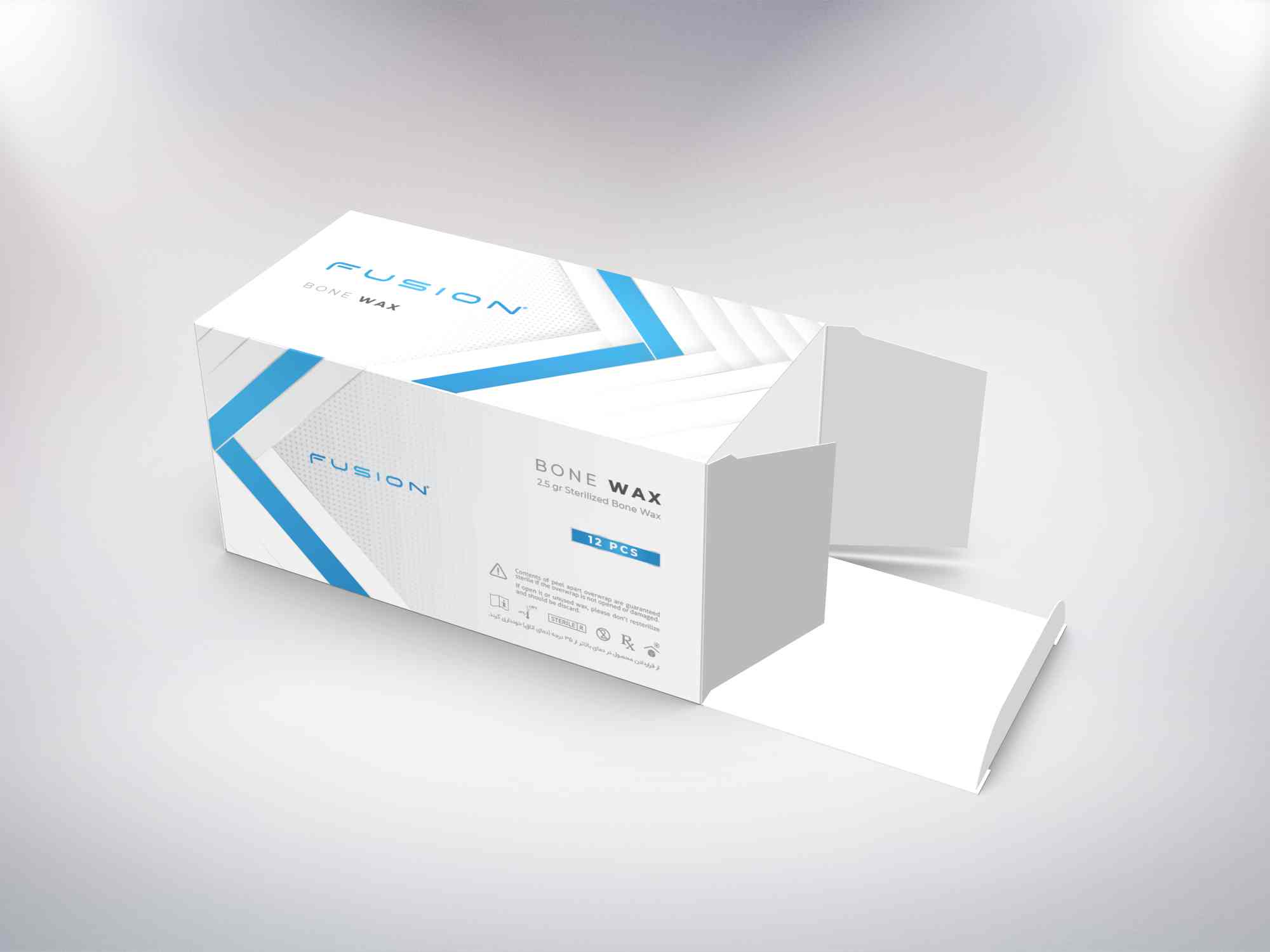
Design language
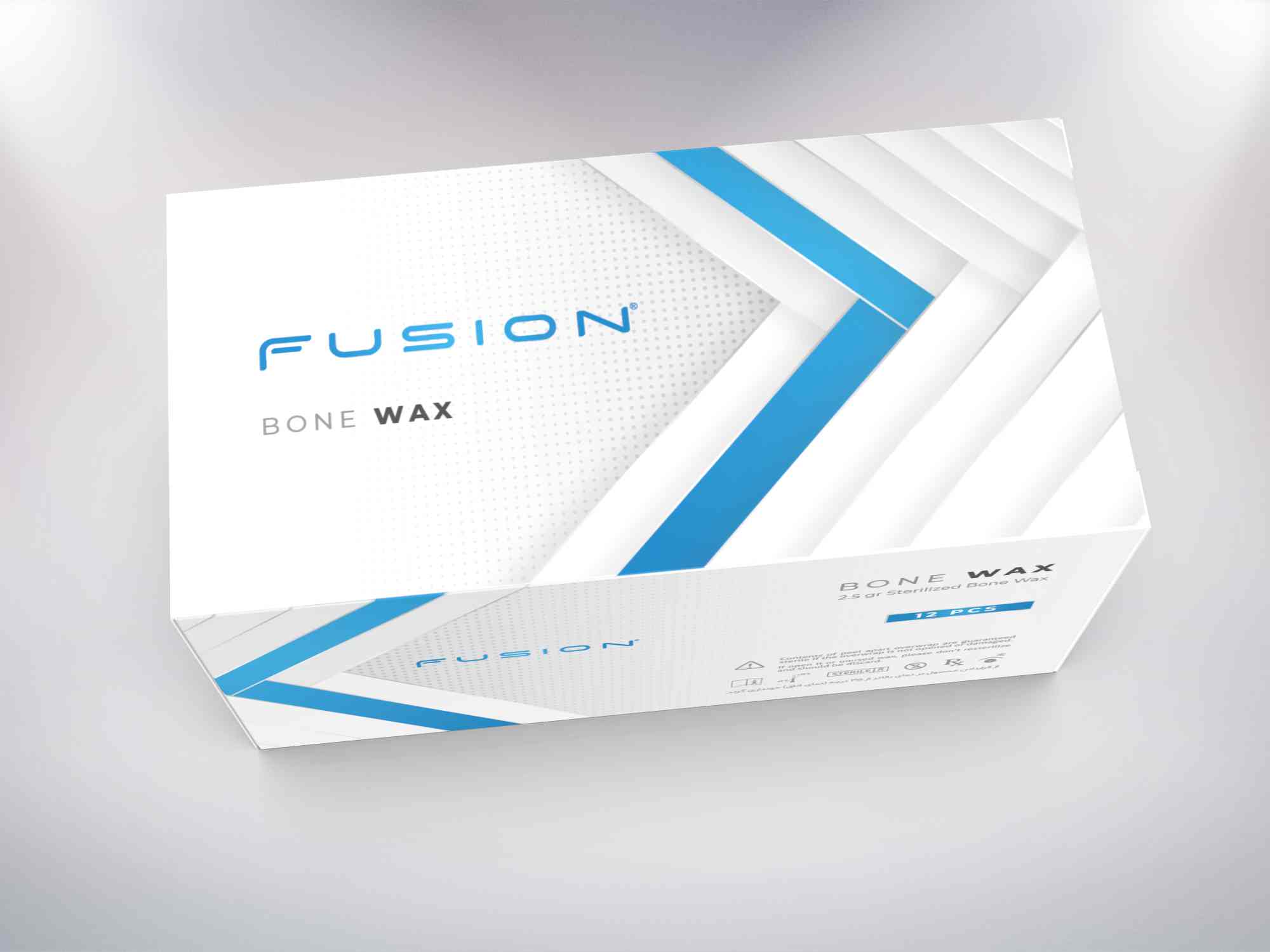
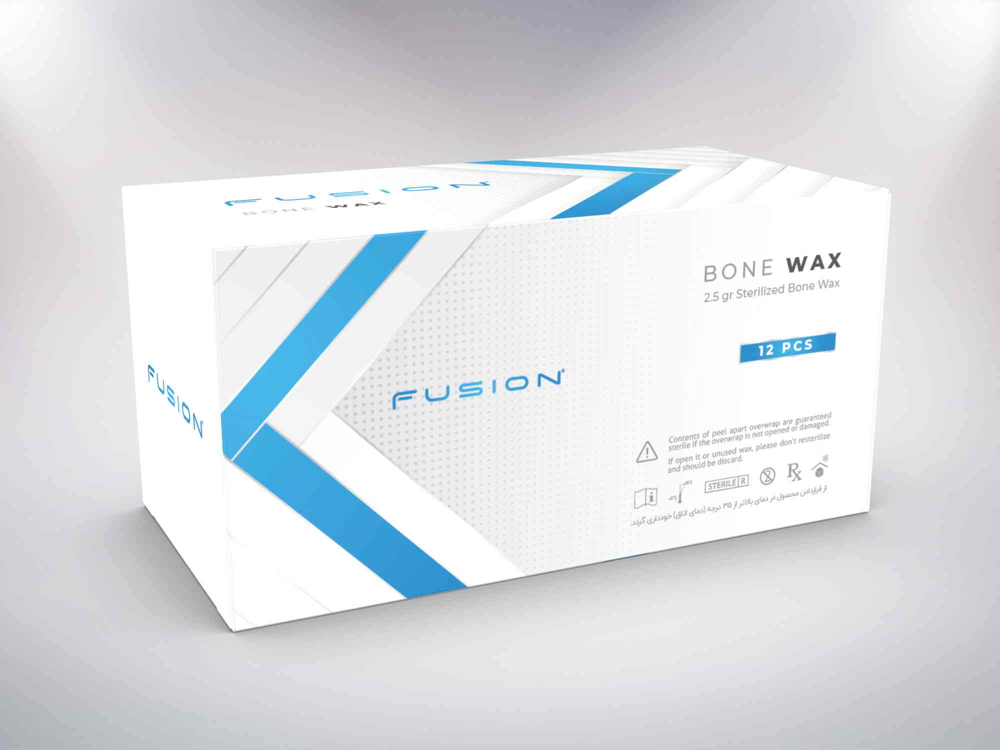
The resulting system is centered on a confident diagonal chevron and a refined typographic mark that anchors the front panel. Our Medical Bone Wax Packaging & Visual Identity Design uses a cool clinical blue as the primary color to communicate professionalism and trust, paired with a soft neutral ground to allow the blue to read clearly in both surgical lighting and retail contexts. The chevron motif performs three roles: it signals the product family across SKUs, directs the eye to the product name and dosage information, and acts as a subtle cue for the surgical staff to orient the box for quick access. We balanced clinical restraint with subtle embossed textures to create an identity that is both functional and memorable.
Structural innovation
Structurally the solution is a folding carton with an internal tray that secures the sachets and allows for single-handed removal — a small but meaningful ergonomic improvement for clinicians. The outer carton was designed with indexed openings and a visual cue so the operator can open the box without compromising the sterile inner pouch. We carefully considered the ratio between box depth and sachet thickness to minimize movement in transit, while preserving a compact footprint for storage. These structural choices support the product’s clinical use and enhance the perceived quality of the brand.
Materials and print execution
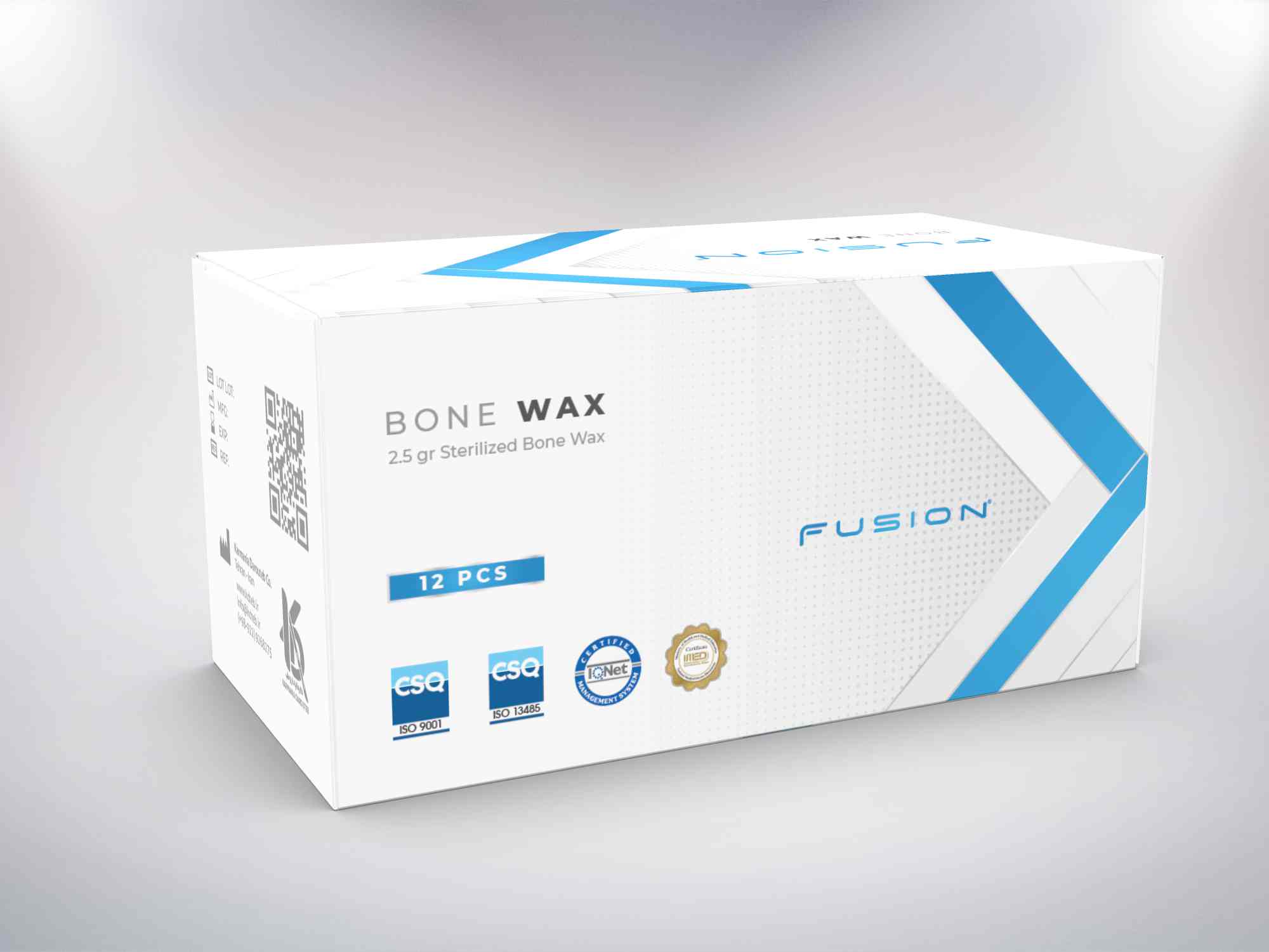
Packsho Agency specified a coated paperboard with a soft-touch matte lamination on the outer carton to convey a premium yet professional feel. The inner sachets use a medical-grade foil laminate to ensure barrier performance and sterilization compatibility. For the graphic finish we combined flat-screen printing for consistent color reproduction with selective gloss varnish on the chevron to add a controlled sheen that reads under clinical lighting. Typography was selected for maximum legibility at small sizes; regulatory text remains prominent but unobtrusive. The composition intentionally avoids heavy ornamentation so every graphic element performs a communicative role.
Visual identity and brand story
The visual identity, developed alongside the packaging system, reframes the product from a commodity item to a considered clinical tool. The logotype and mark, used across carton, sachet, and point-of-order documentation, are designed to scale well on hospital labels, invoices, and digital procurement systems. The identity speaks of surgical precision and clear purpose. Through the Medical Bone Wax Packaging & Visual Identity Design we positioned the brand to be recognizable at a glance in clinical trays and supply cupboards, while also supporting brand recall during procurement conversations.
Production partnerships and quality assurance
Execution required close collaboration with certified pack manufacturers and medical-grade material suppliers. We worked with production partners to validate lamination choices and barrier properties, and to pilot a run that included full sterilization testing of the sachets. Packsho Agency provided production-ready dielines, print-ready files, and on-press supervision to ensure color fidelity and finish accuracy. Quality checks focused on seal integrity of the sachets, readable regulatory print on edge panels, and consistent placement of embossed chevron elements.
Outcome and brand impact
The packaging system launched without disruption and received positive feedback from clinical trial teams and procurement managers. The refined graphic language clarified dosage and handling instructions, reducing time spent searching for product information. The structural changes improved the ease of single-handed access in simulated OR tests. More importantly, the identity work helped the product read as a trusted clinical brand rather than an anonymous commodity, strengthening confidence among clinicians who select supplies under high-stakes conditions. These qualitative outcomes speak to the power of considered design in clinical categories.
Project credits
Packaging and pouch design: Packsho Agency. Structural design, art direction, and print supervision were led by our internal team with production coordination across certified medical packaging partners. The project benefited from iterative prototyping and clinician testing cycles which were central to achieving a product that is both functional and brand-forward.
Invitation
For organizations seeking a rigorously tested and strategically designed presence in clinical markets, Packsho Agency offers end-to-end packaging and identity solutions. If your brief includes sterile formats, procurement-friendly specifications, and a need for a confident clinical identity, we welcome a conversation. For inquiries about Medical Bone Wax Packaging & Visual Identity Design and similar projects, connect with the Packsho Agency team to explore how strategic design can support clinical confidence and operational clarity.