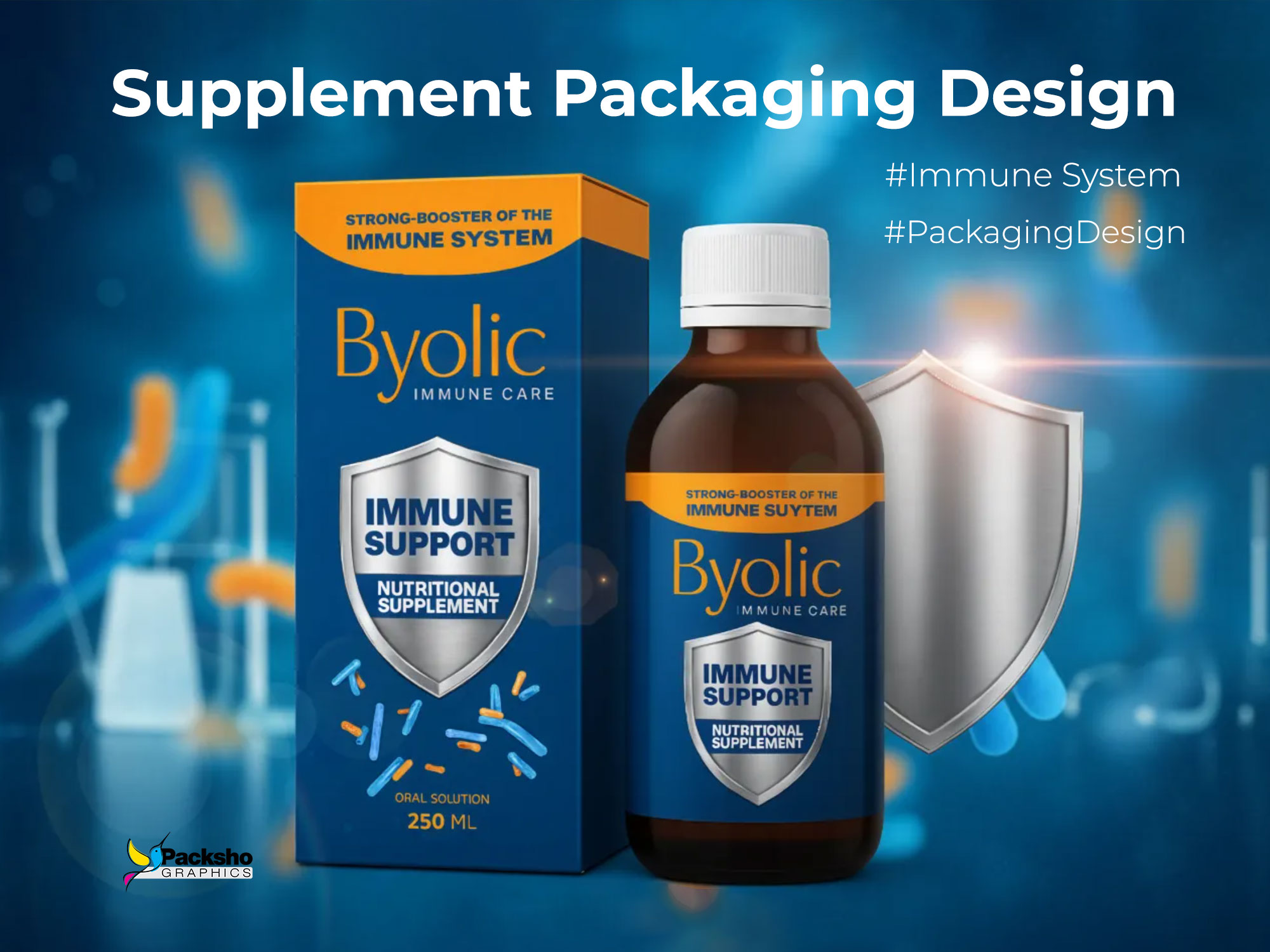
Designing Pharmaceutical Packaging with Authority
At Packsho Agency, packaging design in the pharmaceutical and nutraceutical industries is about far more than aesthetics. It requires a balance of trust, technical precision, and storytelling. The project for Byolic Immune Care Oral Supplement demonstrates how strategic design choices can embody a brand promise while meeting strict market demands. The challenge was to craft packaging that conveys immunity, safety, and premium quality while remaining practical for pharmaceutical use.
Defining the Brand Narrative
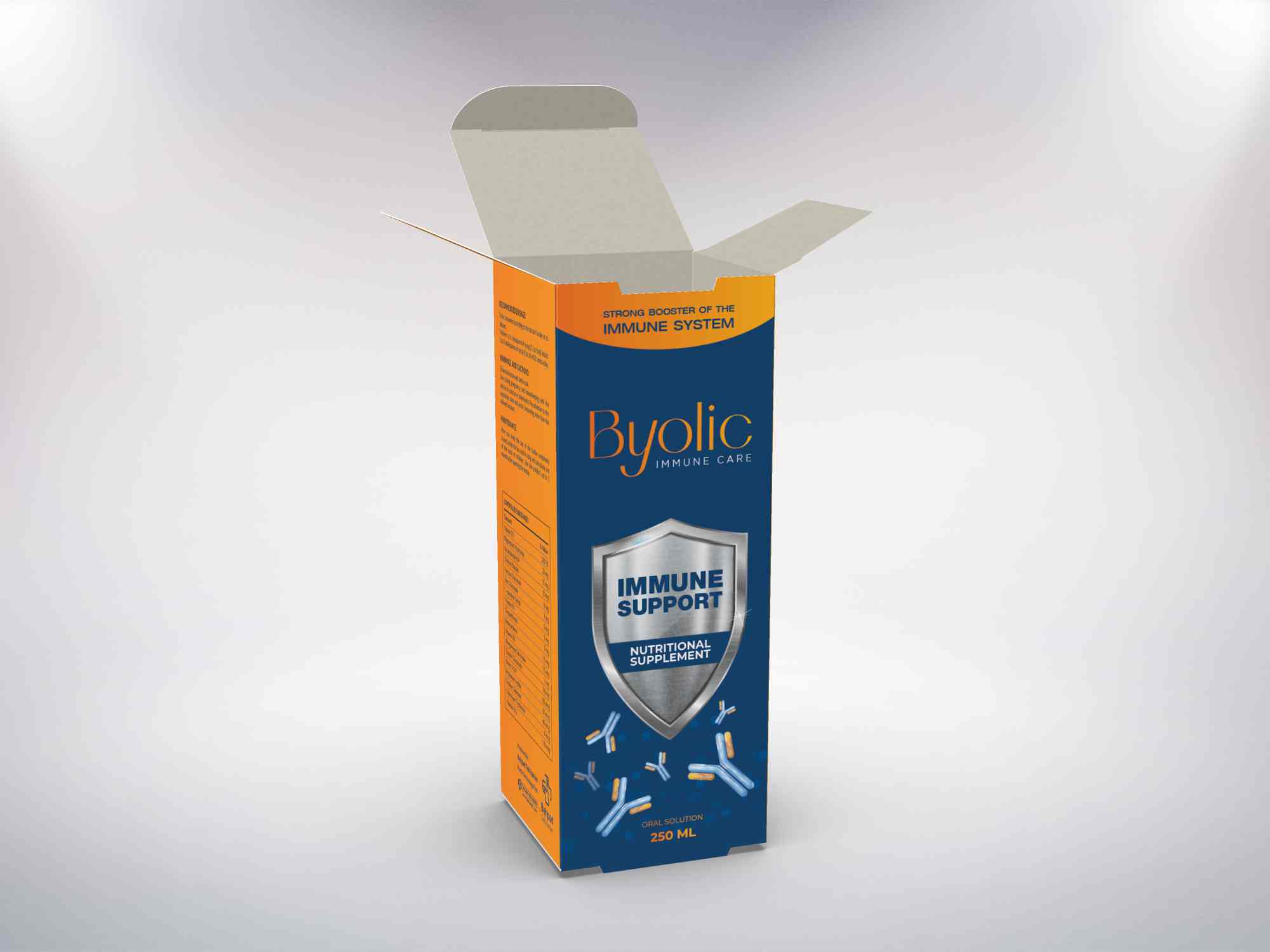
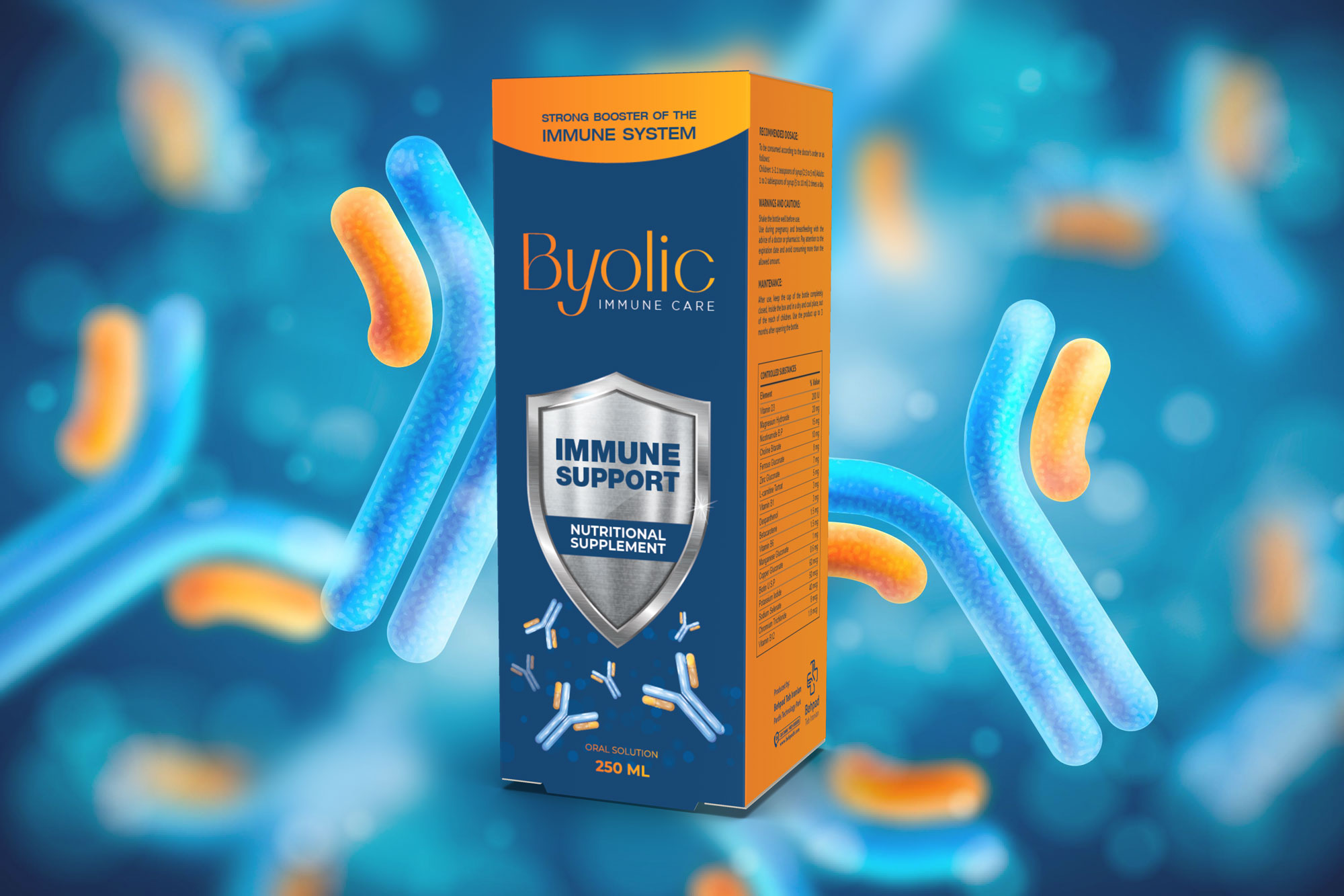
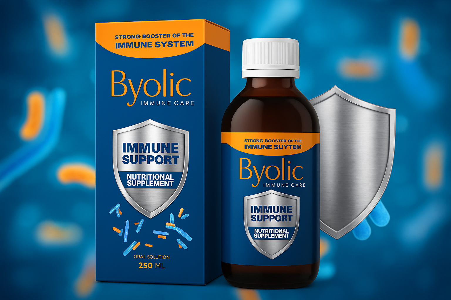
Byolic is positioned as a potent immune system booster. This positioning demanded a packaging solution that would visually translate the idea of protection and resilience. Our design team conceptualized the silver shield as a central emblem, symbolizing defense against external threats. This shield shines prominently on the front panel, becoming a universal icon of protection. It is not merely decorative; it reinforces the core brand story and ensures instant recognition for consumers looking for immune-supporting solutions.
Color Strategy and Visual Psychology
The chosen color scheme features a deep, clinical navy blue paired with energetic orange accents. Navy blue communicates trust, stability, and medical expertise, while orange adds vitality and warmth. This contrast was carefully calibrated to appeal emotionally to consumers while retaining pharmaceutical credibility. Silver detailing through foil stamping on the shield adds a premium touch, capturing light to create a shimmering, reassuring effect of strength and purity.
Structural Design and Functionality
The packaging employs a tuck-end box, chosen for its practicality, ease of production, and consumer-friendly use. This structure ensures secure closure while allowing the box to open smoothly, reflecting the thoughtful user experience. The top flap reveals the precision of structural engineering, reinforcing the sense of reliability from the moment the consumer interacts with the packaging. Inside, the design anticipates efficient bottle placement and secure fit, avoiding unnecessary movement while in transit.
Typography and Information Clarity
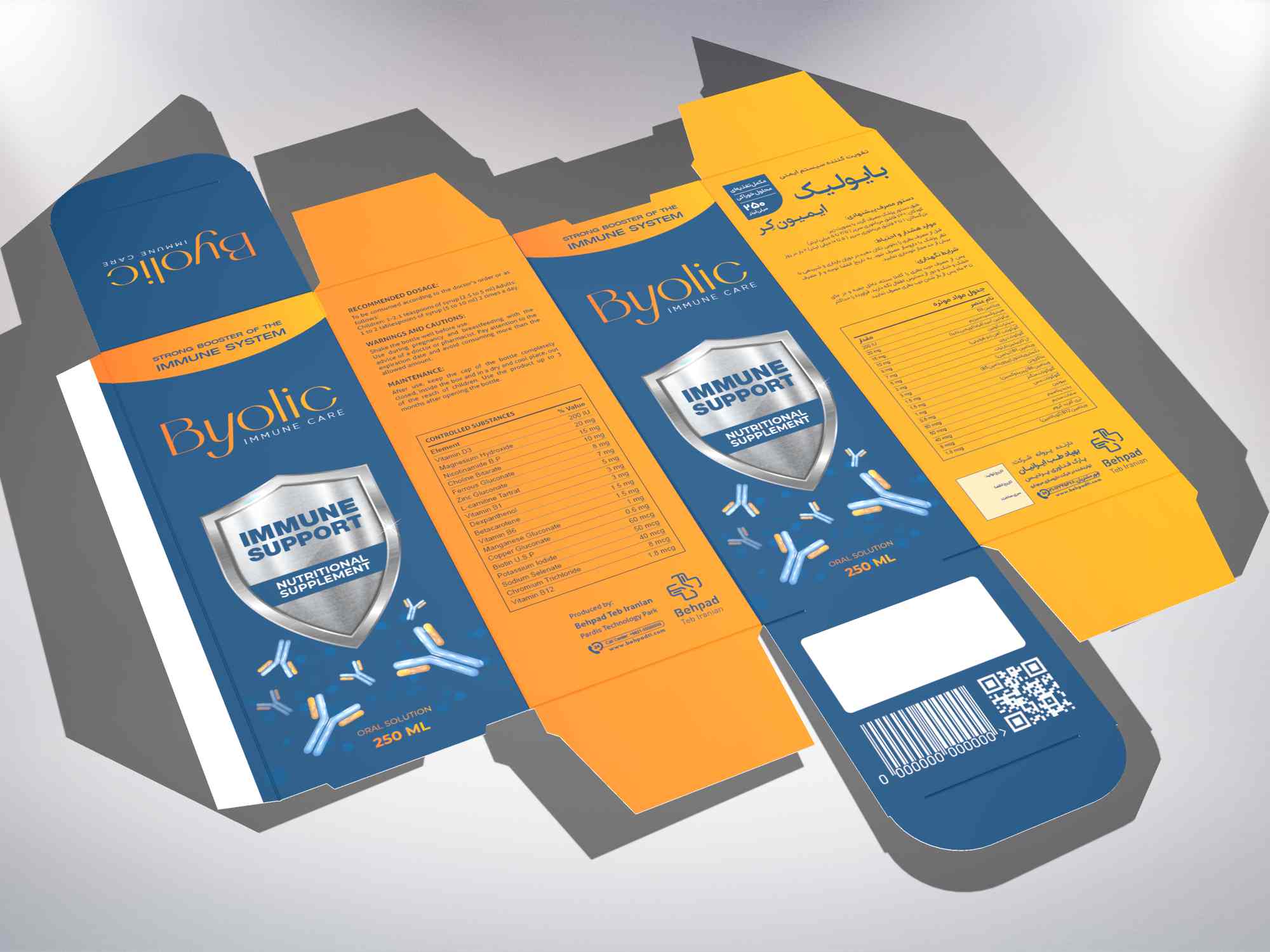
Typography was designed with clarity and hierarchy in mind. Large, bold sans-serif typefaces highlight benefits such as “Immune Support,” ensuring the main function of the product is immediately recognizable. The brand name, Byolic, is presented with subtle elegance, contrasting readability with premium identity. Bilingual communication—English and Persian—is carefully balanced across panels. Each language retains equal visibility, respecting the multicultural consumer base without compromising visual harmony.
Graphic Detailing and Visual Dynamics
The front face features the shining silver shield, enhanced with UV gloss and foil stamping, projecting strength under retail lighting conditions. Subtle background gradients and scientific motifs evoke vitality and innovation without overwhelming the consumer. Floating abstract symbols, representing immune cells and energy, build narrative depth around the product’s function, adding an invisible layer of storytelling for those who engage closely with the design.
Printing and Finishing Techniques
Premium printing methods were chosen to amplify the design’s impact. Matte lamination provides a soft, professional touch that contrasts beautifully with the glossy shield. Selective spot UV highlights essential information, while metallic foiling adds tactile and visual variety. These finishing touches ensure that the packaging communicates both pharmaceutical reliability and luxury appeal, vital in a competitive supplement market.
Consumer-Centric Storytelling
For the end consumer, packaging must be intuitive, clear, and reassuring. Byolic’s box integrates practical elements such as dosage instructions, supplement facts, and cautionary notes, each arranged with careful typographic hierarchy for easy readability. A QR code directs consumers to further educational material, bridging physical packaging with digital engagement. This dual approach reflects modern consumer behavior, positioning the brand as progressive and trustworthy.
Market Differentiation
In a saturated supplement sector, distinctiveness is crucial. Byolic’s packaging differentiates itself not only through premium finishes but also through its storytelling approach. The shield icon instantly communicates protection, while the combination of color, structure, and tactile elements builds a perception of high value. Pharmacists view the product as professional and credible, while consumers perceive it as safe, modern, and effective.
Collaboration and Expertise
This project underscores Packsho Agency’s long-standing expertise in pharmaceutical packaging design. Every decision—from material selection to graphic detailing—was informed by our 20 years of experience helping brands find their voice on the shelf. By aligning form, function, and narrative, we crafted packaging that not only protects the supplement but also communicates its core value: supporting and protecting the immune system.
Conclusion
The Byolic Immune Care oral supplement packaging exemplifies the fusion of creative design, technical precision, and brand storytelling. From the tuck-end box structure to the shimmering silver shield, every element reinforces the idea of health and protection. If your pharmaceutical or nutraceutical brand is seeking packaging that resonates with both trust and innovation, we invite you to connect with Packsho Agency to bring your vision to life.