Project Overview
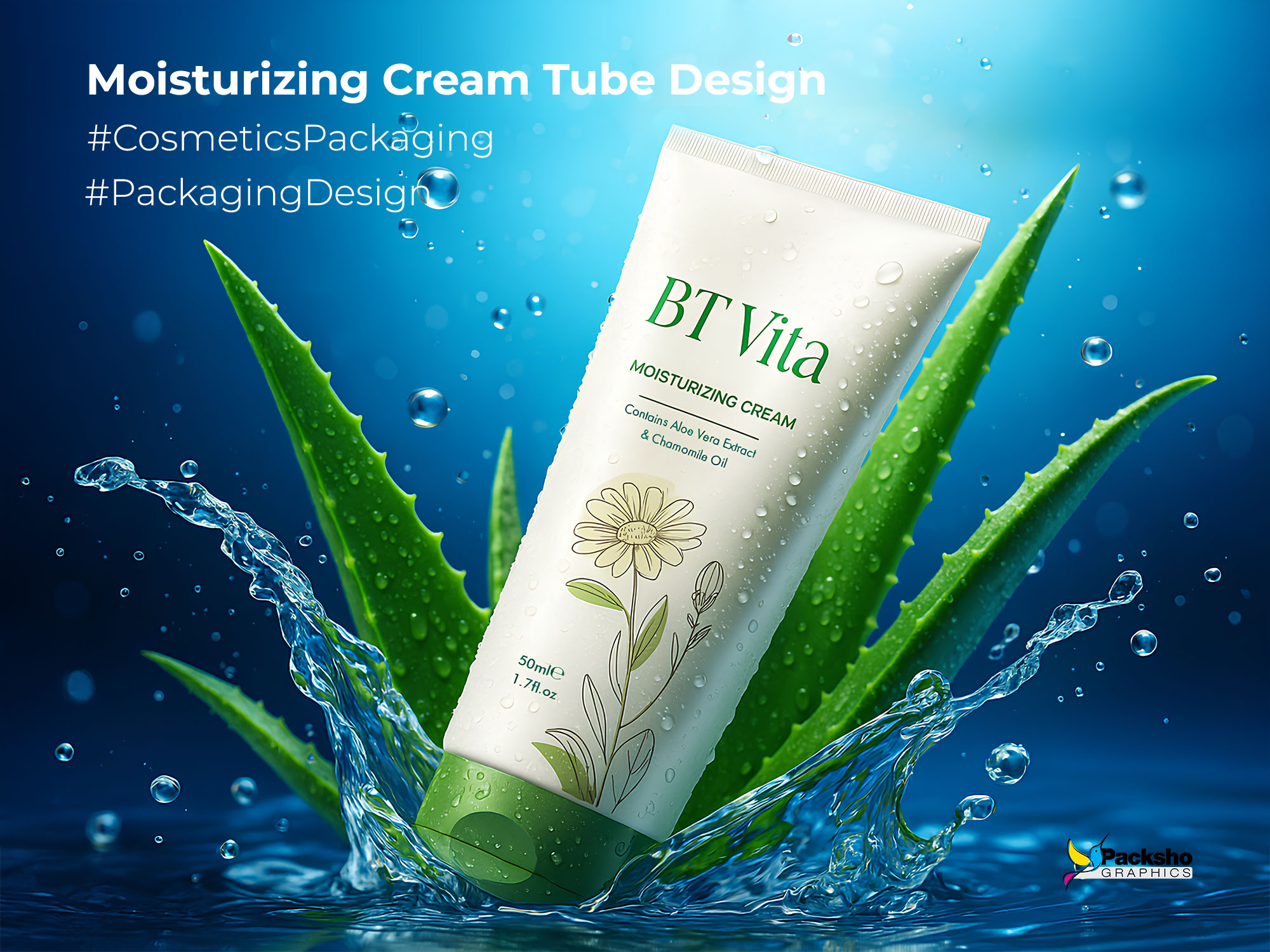
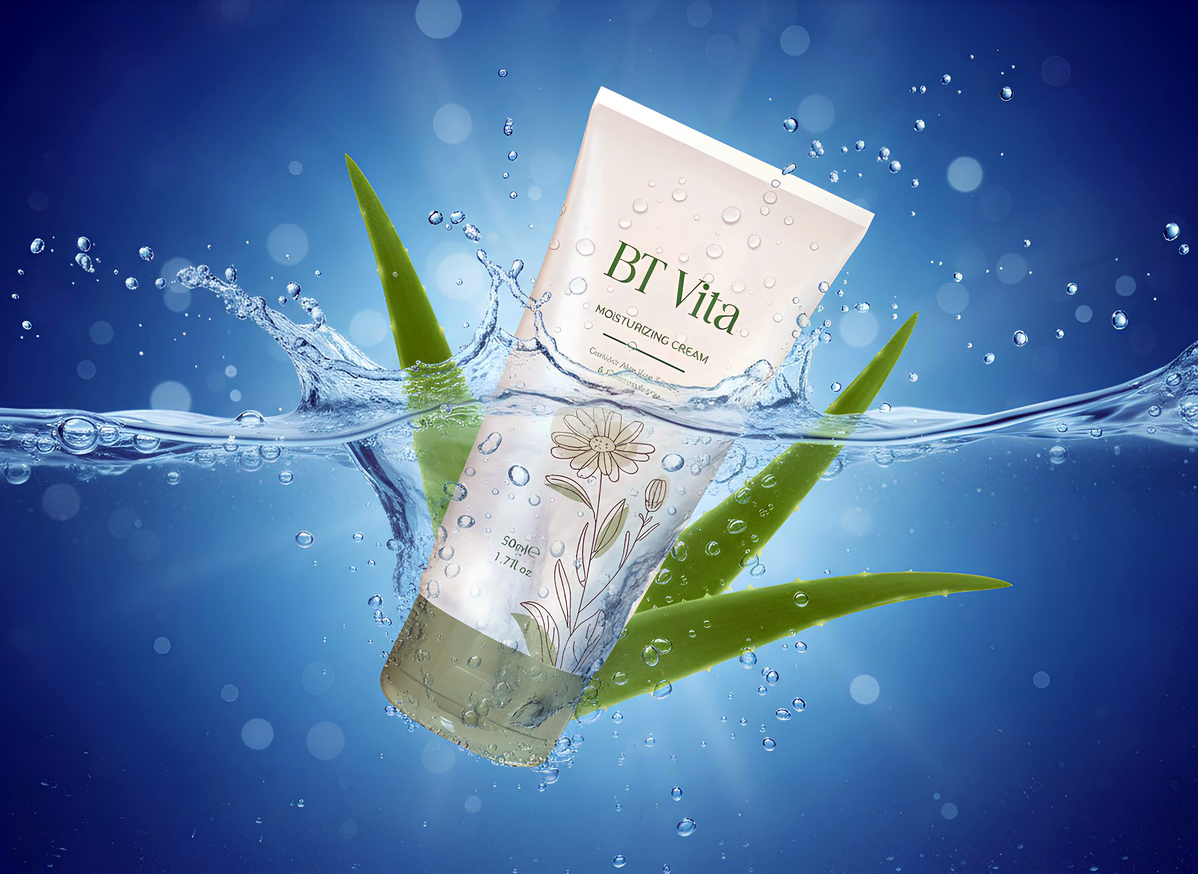
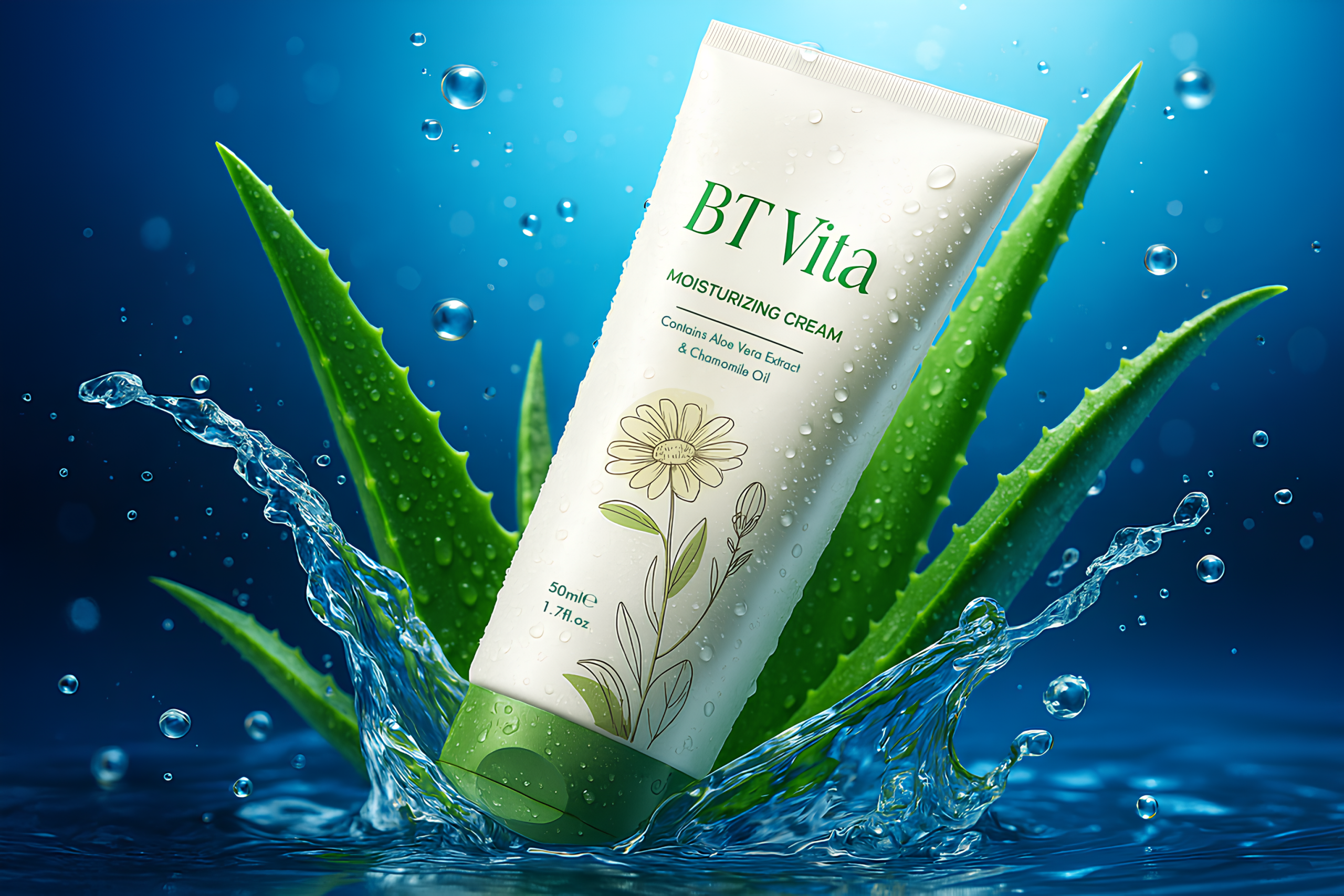
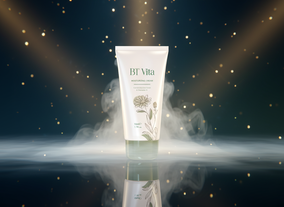
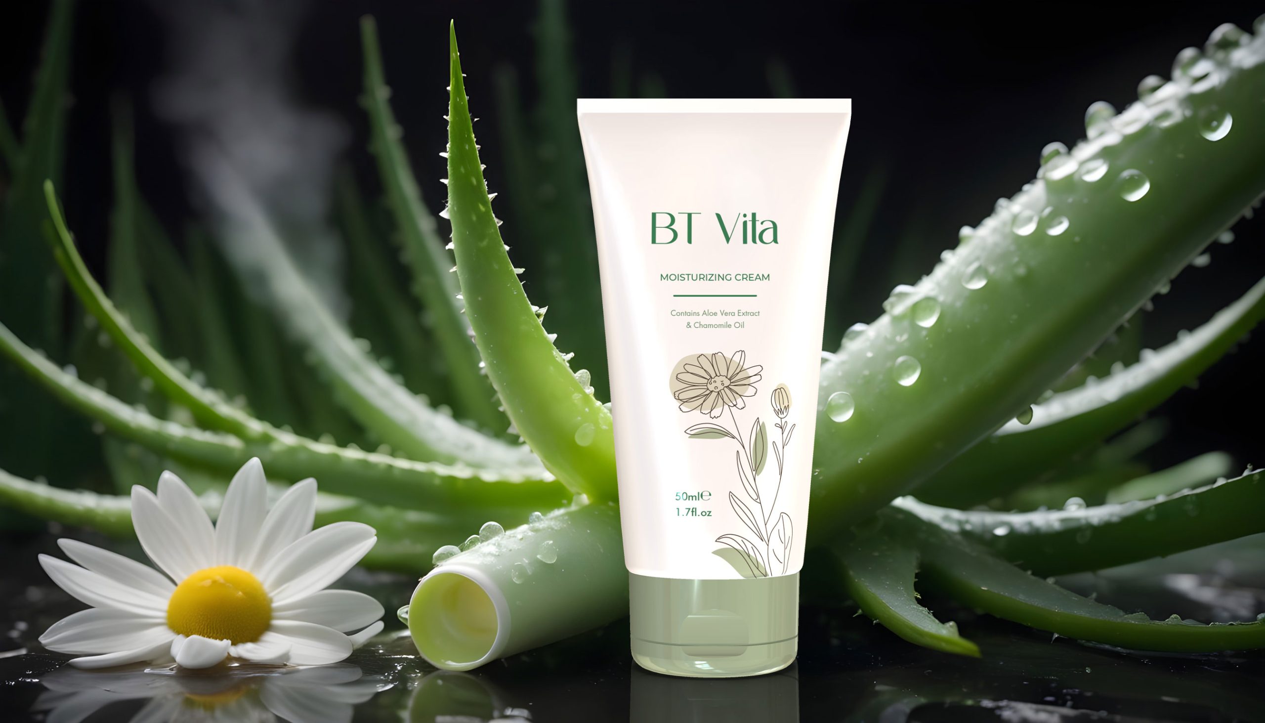
At Packsho Agency, packaging is never just about holding a product; it is about translating a brand’s promise into a tangible form that consumers immediately connect with. The BT Vita Moisturizing Cream tube packaging design was created to reflect purity, natural nourishment, and a sophisticated skincare ritual. This 50ml cream, enriched with Aloe Vera and Chamomile oil, needed packaging that could capture its essence while offering practicality and elegance in equal measure.
Understanding the Brand and Consumer
Before we began the design process, our team studied the positioning of BT Vita in the skincare market. This is a brand that appeals to consumers seeking effective hydration with a natural foundation. The product formula itself communicates softness, calm, and everyday usability. Our goal was to echo these qualities in the packaging—creating a tube that feels as gentle and trustworthy as the cream inside.
Structure and Material
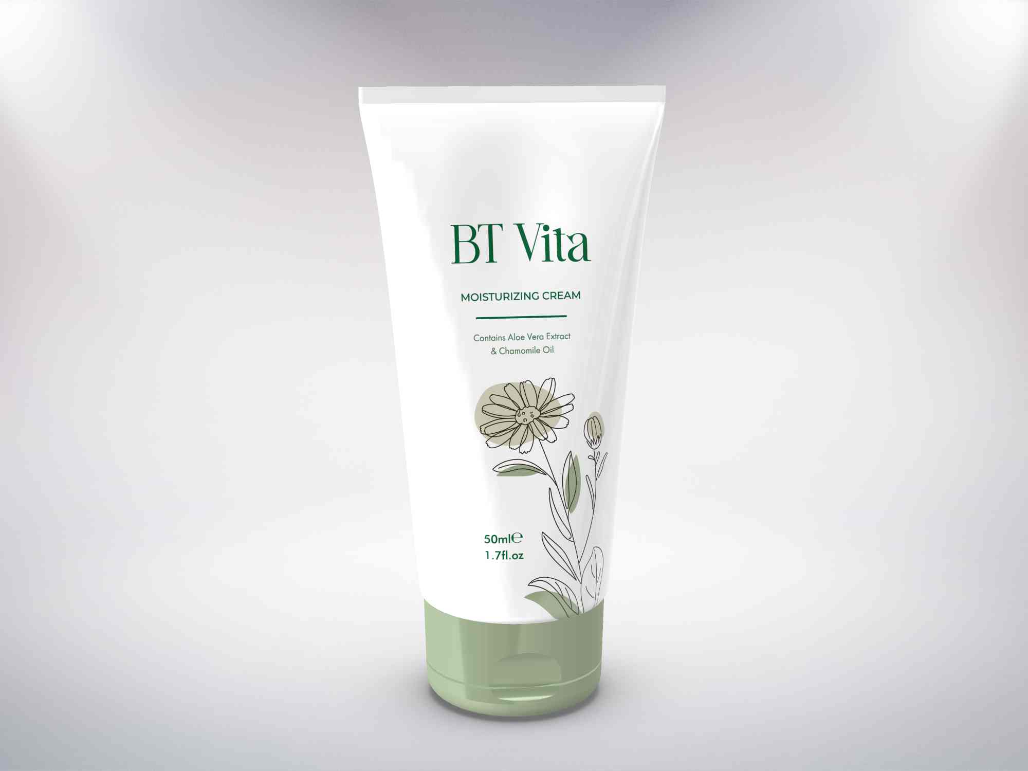
The choice of a squeezable tube was not accidental. Tubes are intuitive for consumers, offering convenience, hygiene, and portability. For BT Vita, we specified a laminated tube structure that combines durability with a premium tactile finish. The surface allows for high-quality printing while protecting the product from environmental exposure. The cap, designed in a muted green shade, ensures consistency with the graphic theme while providing a secure, easy-to-use closure. The overall form is compact and ergonomic, fitting comfortably in the hand and in a handbag, making daily use effortless.
Graphic Storytelling
The heart of this packaging design lies in its graphics. We avoided clutter in favor of a clean white base, symbolizing purity and trust. Over this backdrop, delicate botanical illustrations were introduced to highlight the natural origin of the ingredients. The fine line art of the chamomile flower connects directly with the product’s calming qualities, while subtle green leaf details reinforce the connection to Aloe Vera. The design is restrained yet expressive, allowing the artwork to tell the product story without overwhelming the eye.
Typography and Brand Presence
Typography plays a critical role in building recognition. For BT Vita, we selected a refined serif logotype in a deep green tone—modern yet rooted in nature. Supporting text was kept minimal, ensuring that the product’s core attributes such as “Moisturizing Cream” and the mention of Aloe Vera and Chamomile oil are instantly readable. Hierarchy in typography was carefully balanced, with brand presence at the forefront and product details as accessible layers beneath.
Color Language
Colors were chosen to echo the product’s natural promise. White dominates as a field of clarity, while green serves as the accent that communicates growth, calm, and organic purity. The soft green shade on the cap anchors the design visually and ensures harmony across all elements. Together, these tones create a calming aesthetic that directly appeals to skincare consumers seeking balance and authenticity.
Production Techniques
In cosmetics packaging, execution is everything. We employed precision offset printing combined with a soft-touch laminate, giving the tube a subtle matte feel that enhances grip and communicates quality. The botanical illustrations were printed with fine-line accuracy, ensuring they retained their delicate elegance even at small scale. The logo and key descriptors were finished with spot gloss, adding subtle emphasis without distracting from the overall minimal design approach. The result is a tube that feels as premium in the hand as it looks on the shelf.
Consumer Experience
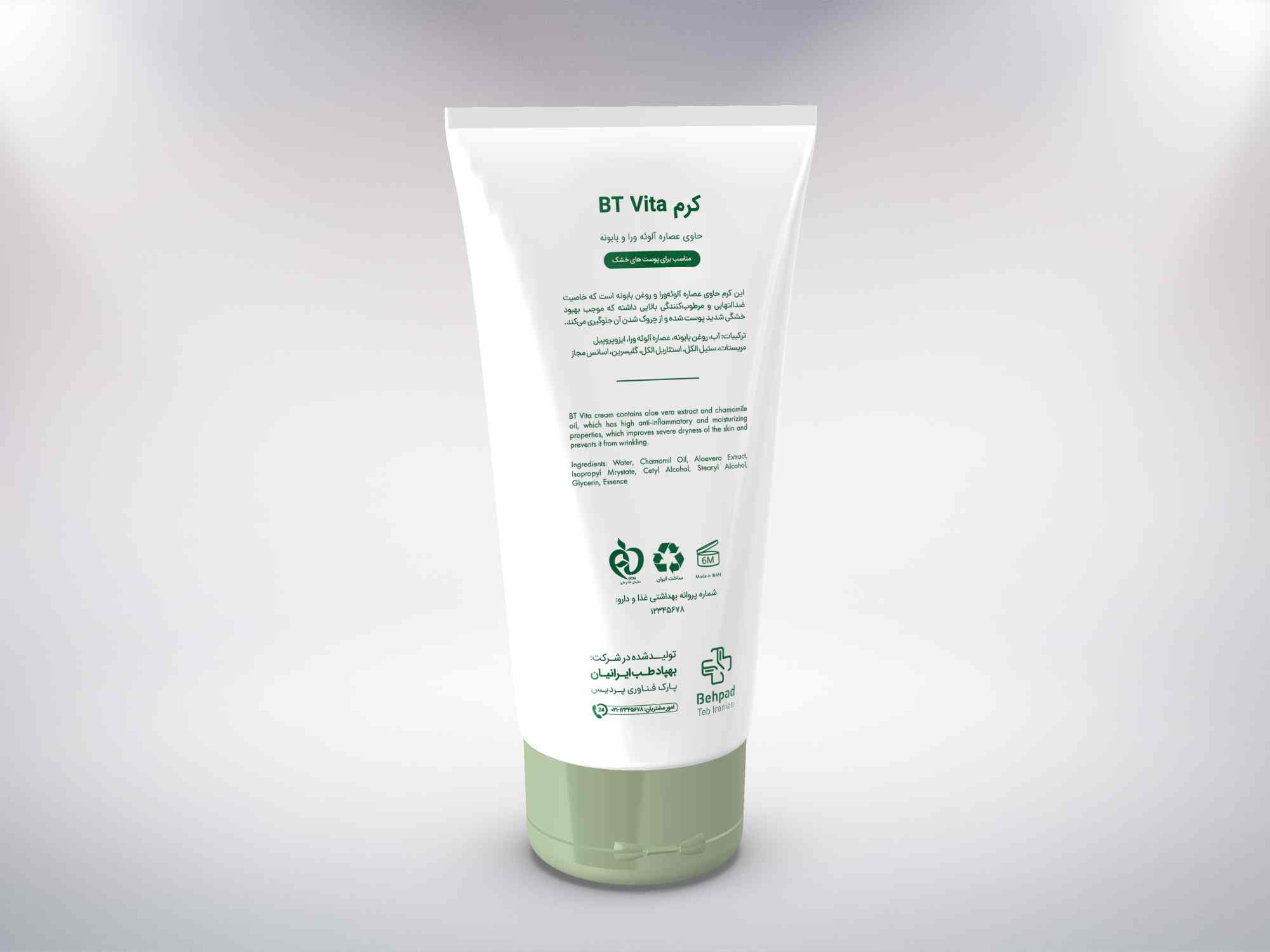
Beyond aesthetics, packaging must function seamlessly for the user. This tube design ensures an easy squeeze with no product waste, while the closure mechanism prevents leakage and protects the cream. The smooth matte finish enhances tactile satisfaction, creating a sensory link between the outer package and the soothing cream inside. Every detail—from hand-feel to legibility—was refined to create a coherent consumer journey.
Supporting the Brand Story
BT Vita is positioned as a modern skincare brand built on natural efficacy. This packaging helps tell that story at first glance. By using visual cues such as botanical line art and organic color language, the packaging reinforces the natural ingredients and positions the product as trustworthy and effective. The harmony between graphics, typography, and structure ensures that the packaging becomes an ambassador of the brand promise every time it is picked up from a shelf or taken out of a bag.
Market Differentiation
The cosmetics aisle is saturated with competing products. The BT Vita Moisturizing Cream tube packaging design differentiates itself through restraint and focus. Where others may opt for flashy graphics, this design speaks softly yet with confidence. It attracts the consumer who values subtlety, natural care, and thoughtful detail. By aligning design choices with consumer expectations, the packaging gives BT Vita a competitive edge in an oversaturated market.
Sustainability Considerations
Modern consumers expect sustainability to be part of brand responsibility. While tubes present challenges in recycling, we worked with manufacturers to ensure the chosen material had improved recyclability compared to conventional options. Clear communication on responsible disposal was considered for secondary packaging, further reinforcing BT Vita’s dedication to consumer trust and environmental mindfulness.
Impact on Shelf Presence
The shelf is where design decisions prove their worth. Against the visual noise of competing skincare products, this packaging draws attention through calm clarity. The minimal color scheme and precise illustrations invite the consumer in for a closer look. It communicates confidence without the need for excessive decoration—a strategy that resonates strongly with the target audience.
Conclusion and Invitation
The BT Vita Moisturizing Cream tube packaging design embodies what Packsho Agency does best: combining structural ingenuity, graphic sophistication, and production expertise to create packaging that resonates with both brand and consumer. Every choice, from material to typography, was made to honor the product’s essence and ensure a memorable user experience. For brands seeking to transform their products into design-driven icons, our agency is ready to craft solutions that not only protect but also inspire.
Contact Packsho Agency today to explore how thoughtful packaging design can redefine your product’s story.

